Advertising in general is in a state of flux these days, half way between exiting print media and transferring to online. The problem is that online is still something of a Wild West scenario that has not yet settled down into a mature medium. It is reminiscent of the old VHS versus Betamax tussle of the late 1970s. Where is best to burn the advertising spend?
One thing that has not changed is the effectiveness of good old fashioned offline marketing like leaflets, billboards and, of course, point of sale promotions. Bricks and mortar outlets are due to experience something of a renaissance according to an article in Forbes magazine, Retail Shopping Predictions for 2018. Interestingly, one of the attractions that the article reckons will bring consumers back from soulless online shopping is good old-fashioned personal service.
Let’s consider some of these predictions and try to match them with POS design concepts that could appeal to the underlying driving emotion. This may represent a departure from simple guidelines such as “use pastel shades” or “so and so typefaces are the coming thing”. These concepts transcend any visual design tips and aim more for the soul than the eyes.
1) Give 'Em New Reasons To Shop
To counteract the single biggest attraction of online shopping – lower prices – savvy high street retailers are turning to the tried and trusted Free Offer concepts. For example, buy this chocolate bar and get a tube of these sweeties for free. That is a very simple example but it encapsulates the concept.
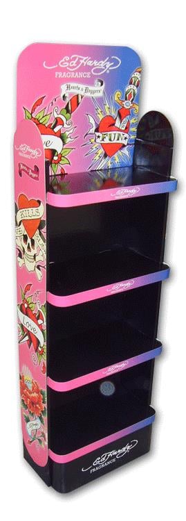
Point Of Sale stands that develop this concept might have two product bins built in: one for the main product and one for the promotional freebie. That differential alone will cause the consumer to stop and stare, which the first law of successful POS displays – get their attention.
2) Autonomous Sensory Meridian Response
That involuntary tingling sensation that starts in your scalp and works its way down your back is called autonomous sensory meridian response. It is mostly triggered by audio or visual stimulus, which is why some pieces of music can stop us in our tracks.
That predictions article suggests that brands will focus on delivering a greater, deeper and more effective experience. In fact, it asserts that shoppers will return to high street outlets in search of experiences that they cannot find online. The challenge for POS designers is to channel suitable stimulating energy to achieve something resembling a tingle down the spine. The best part is that it only has to work once for a consumer. The experience will be memorable. We leave it up to designers to come up with solutions to deliver “a deeper and more differentiated brand experience” but respectfully suggest that visuals may be the way to go to avoid irritating shoppers with unwanted “noise”!
3) Hologram Display Patches
Winning the battle for shopper attention gets harder every year as more visual displays vie to dominate the in-store landscape. It’s time to try something new by utilising existing “old” technology in a new way. Eye catching hologram patches impart a sensation of being a moving image as the shopper moves past the display. Movement always engages the peripheral vision and so adds an extra hook to make the consumer take a look.
Finally – it’s a great idea to run new and innovative POS display design ideas past experienced specialist designers, which is what we are. Successful POS displays depend not only on good and attractive design but also on market knowledge and experience. Knowing what has failed in the past, and why, is just as valuable as knowing what works best.


 Celled DVD Unit
  Punto Dumpbin


No comments