People often ask what the difference is between Point Of Sale displays and Point Of Purchase. The most commonly held view is that Point Of Purchase displays are scattered around the store where the customer chooses some product. By contrast, Point Of Sale is often held to be at or close to checkout, where customers have completed their shopping and are about to open their purses or wallets to make payment.
Under that definition, most Free Standing Display Units would count as Point Of Purchase because they are normally positioned in aisles and throughout a store. The reality is that most people consider all of these in-store displays to be Point Of Sale. It is a minor distinction.
AIDA
Displays must follow the old AIDA sequence, beloved of salesmen for almost a century: Attention, Interest, Desire, and Action.
1. Grab Attention
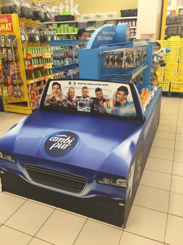
Without the attention step, the others never happen. Therefore catching the eye of the passing shopper is paramount and is the #1 objective of our designers. There are, of course, innumerable methods for achieving that but 99% of POP/POS displays depend on passive visuals. Some do incorporate audio-visual aids and they do have their place for higher ticket products.

Credit: http://www.thesellingpoints.com/2016/03/ambi-pur-special-product-display.html
2. Interest and Desire
Placement has an obvious part to play in generating interest. Consider the image below and then imagine the products in an IKEA setting. In other words, the product promotion must be in line with what the customer expects to find, and not be unsettling or off-putting – despite the need to grab attention first.
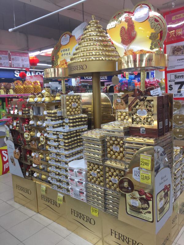
We think that this gorgeous Ferrero Rocher promo would have us loading the product into our shopping trollies. Of course, the original FR packaging design was inspired in any case, and was built on with their “Ambassador’s Reception” TV adverts. This display stand does little more than reflect and enhance those brand properties – but that is all that is required in this case for this product.

Credit: http://www.thesellingpoints.com/2017/01/ferrero-rocher-2017-cny-supermarket-display.html
3. Make It Memorable
People love Experiences. They will take away the memory of your POP display if you provide enough stimuli. This outstanding Malibu tasting point at Alicante Airport is perfect placement to position Malibu as a holiday tipple. It appeals to more senses than most POP displays are required to do – visual, taste, smell, touch (and probably sound too, we cannot tell). And all wrapped up in the already exciting experience of arriving for your Spanish holiday. The clever organiser of this display certainly got excellent value for money in terms of brand exposure and positive connotations.

Credit: http://ispyexperiential.blogspot.co.uk/2011/10/malibu-sampling-at-alicante-airport.html
Maximising The POP Opportunity & Payback
POP displays boost sales – that is an undisputed fact. The extent to which they are effective does depend on some obvious factors:
- Relevance
- Attractiveness
- Messaging
- AIDA
Visual design is a key component of truly successful displays, both to grab attention initially and to convey the brand or selling the trigger message convincingly so as to activate the desired action. That is why it really does pay to engage a highly professional and experienced team for 3D display concept consultancy, design, printing and even implementation and rollout. Maximise the opportunity.


 Celled DVD Unit
  Punto Dumpbin


No comments